Welcome to HarperVoyager
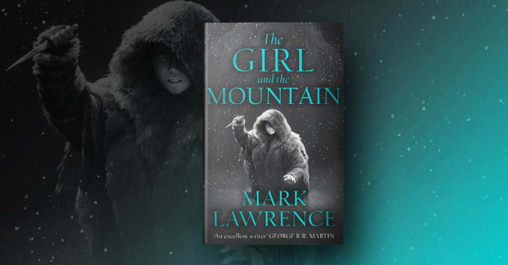
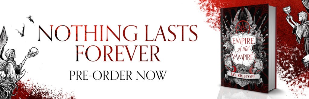
The home of fantasy, science fiction, horror, and YA at HarperCollins, we are one of the world’s greatest genre lists. We publish giants such as George R.R. Martin, Raymond E. Feist, and Robin Hobb, bestsellers such as Peter V. Brett, Mark Lawrence, Jay Kristoff, and Sabaa Tahir, and classic fiction by all-time greats such as Isaac Asimov, Arthur C. Clarke, Philip K. Dick, and Ray Bradbury. We are also incredibly proud of our commitment to developing the brightest new talents such as S.A. Chakraborty, Tessa Gratton, Anna Stephens, Anna Smith Spark, Peng Shepherd, R.F. Kuang and many more.
Latest News
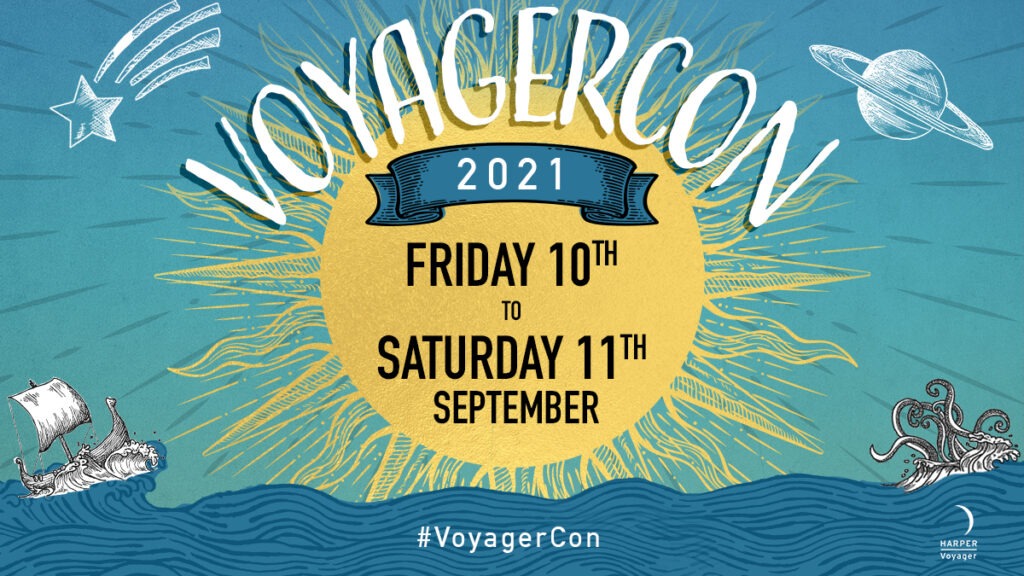
Voyager Con 2021
We’re thrilled to announce VoyagerCon 2021, a festival of events exploring the worlds of fantasy…
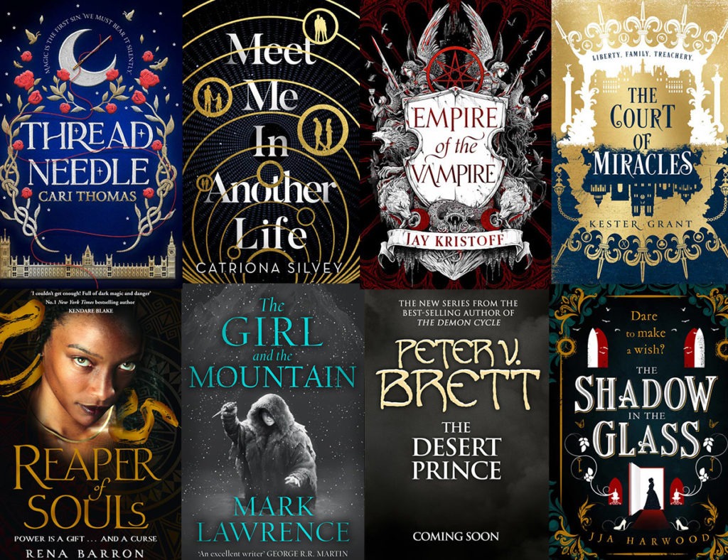
Our top picks for your 2021 TBR pile
Setting your reading resolutions for 2021? Determined to lose yourself in more incredible fantasy this…